Website Redesign
Guiding Light
A new website that can evolve and grow with the organization.
Summary
Guiding Light Mentoring was founded in 2014, and since then, the organization has grown significantly but the design of the website has not been re-evaluated. This has led to problems such as inconsistent branding and confusing navigation. To address these issues, I volunteered to design a completely new website. The results were an improved user experience and consistent branding throughout the website.
My Role
Worked closely with organization CEO to understand user challenges and business goals
Designed wireframes in Figma
Translated designs into Wix
Users
A diverse community with one common goal
-

Prospective Mentors & Mentees
May be unfamiliar with Guiding Light Mentoring
Mentees may be struggling in school or in other aspects of their life
Mentors may be unsure of how they can get involved
-

Current Mentors & Mentees
Have an understanding of the Guiding Light mission and vision
Need to find important information such as upcoming events and training materials
May be unfamiliar with the opportunities Guiding Light offers outside of the mentorship program
-

Volunteers & Donors
Want to stay connected to current events and up-to-date information related to Guiding Light
Are interested in learning how their support and money can help the organization
Goals
With these challenges in mind, I aimed to achieve the following goals:
Establish a cohesive identity to be used across the website
Simplify site navigation so users can easily learn about the organization and get involved
Design a layout that can seamlessly expand as the organization grows over the next few years
Design Solutions

Pulling the user in with a great first impression
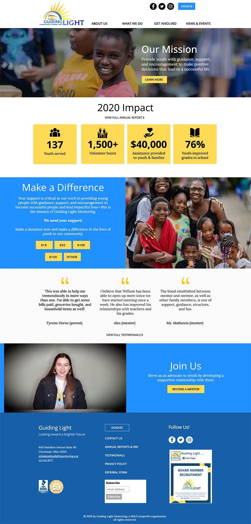
The homepage is many user’s first impression of Guiding Light Mentoring. Therefore when designing the new homepage I strived to answer two important questions: Who is Guiding Light and why should the user spend more time on the site.
To achieve this, I used imagery along with the mission of Guiding Light Mentoring to lead the user to the About page where they can learn more about the organization. Below that I used graphics and numbers to bring attention to the impact Guiding Light has on the community.
Encouraging action with clear language
The biggest aspect of Guiding Light’s work is mentoring youth through their mentorship program. Despite this, finding information about mentoring using the previous navigation was difficult and unclear because of the language and organization.
Contents of navigation menu before website redesign
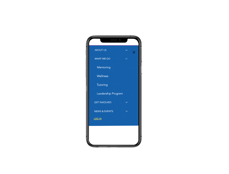
To address this, I changed the language in the main navigation to be clear and bring attention to the mentorship program.
Contents of navigation menu after website redesign
Establishing a cohesive identity
The previous Guiding Light website lacked a cohesive and unique brand identity. This is an important part of a website because it gives the user a glimpse into the personality of the organization and helps them remember it in the future.
Using the Guiding Light logo as a starting point, I created an identity to use across the new site.

Optimizing across all devices
Using Wix Analytics, I found that just under 50% of Guiding Light users are on a mobile device. So, it was very important that the website be designed with all screen sizes in mind.
Takeaways
When I started this project, I didn’t know anything about Guiding Light Mentoring. This gave me a unique and sometimes challenging perspective that taught me a lot about my design process.
Some key takeaways from this project are:
Ask lots of questions. Since I didn’t know anything about the organization when I started, it was important that I asked a lot of questions to get a full understanding of Guiding Light Mentoring and their users.
Design a solid site map. As one of the first phases of my process, I spent a lot of time on redesigning the site map. I gained a good understanding of everything the site would entail and therefore didn’t run into any big surprises when I started designing the page layouts.
Design with image quality in mind. In some of my first drafts, I was using low quality photos that were taking away from the design rather than adding to it. Luckily, I was able to work with the organization to get better photos but if that had not been the case, it would’ve been important to redesign the headers to accommodate the low quality photos.


